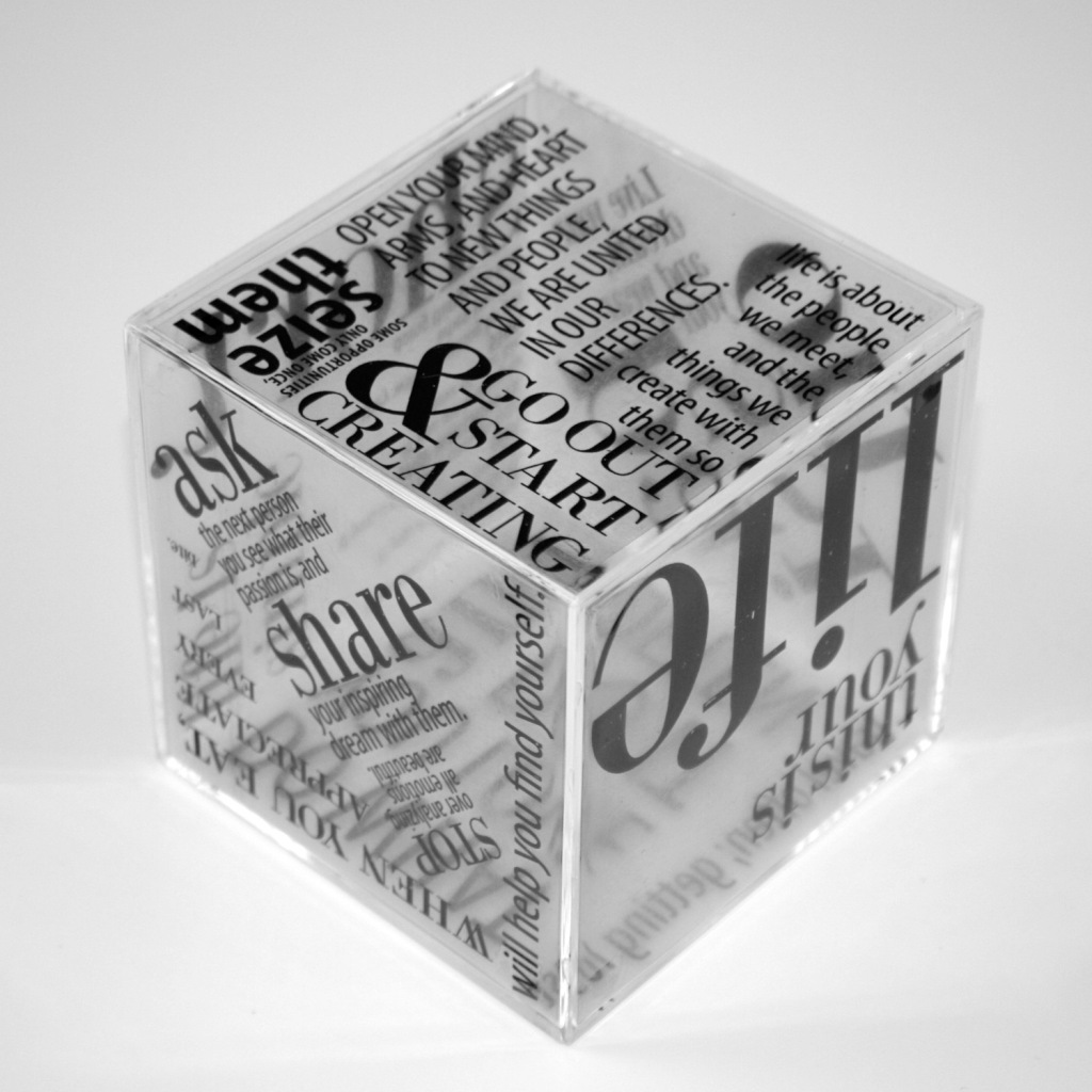
My Entry for The 8th Annual Asian Heritage Street Celebration

May is Asian Heritage month and every year San Francisco has a wonderful street celebration. It is the largest gathering of Asian Pacific Americans in the nation (according to their site) and offers an array entertainment, food, educational sessions -- a great place for families and friends to attend to learn more about all the different cultures. In addition to the celebration, there is always a poster contest. The fun part is that if you are the winner your design would be used for all marketing materials. The challenge is to create a design that incorporates the year's number, like this year was 8.

I've always wanted to enter the contest and decided to go for it this year. I submitted my design with my fingers crossed. I didn't end up winning, but I'm happy I actually went for it and not just sit back and wonder if I could go for it or not. There's always next year!

Congratulations to the winner, Klaudiusz Madej. You can see the winning design here: http://asianfairsf.com/2012/03/origami-flowers-blossom-as-ahsc-poster-contest-winner/ 

Also, you can see the other 50 submissions here (Pretty cool to see mine up there!) : https://www.facebook.com/media/set/?set=a.369753716391507.91798.107575025942712&type=3&l=ca7da01791

If you're in the Bay Area during the celebration, stop by the event and hang out!

Editorial Layout: Hillman Curtis

This was part of my final editorial layout which was focused on short documentary film director, Hillman Curtis. I am really proud of this layout . I was inspired by film reels, hence the black borders. My second inspiration was the letter H for his name. Can you spot the H layout?

Take some time to look up Hillman Curtis and perhaps you will be as inspired as I was. Musician, Graphic Designer and now film maker.

You can check out all his short films at: www.hillmancurtis.com 


Do you know Paula Scher?

At the beginning of the semester, our first assignment for typography/InDesign class was to research Paula Scher and do an article layout about her. I was so inspired by what I had researched and she is someone I know I will be continuously studying. What makes Paula Scher unique was she took used typography as her art. Instead of words being second to image in design, they became the focus.

Her use of typography throughout the years has changed the world of design and how we use it in our designs.

Below is my layout and I have attached a video from a talk she had done. I hope you find her as inspirational as I had.

Paula Scher Gets Serious

An Update & Paul Rand

It's been a while since I've posted and that's because I've been swamped with a fun load of projects to tackle in preparation for the end of the semester. I have about two to three big projects to tackle per class for the final, on top of the ongoing assignments. It's been a challenge, but great exercise on multitasking and stretching my brain creatively. My days have consisted of waking up extremely early to go to work around 5AM or 6AM and then class and homework afterwards. Some days, my days end around 11PM after spending more than 12 hours on the computer or drawing.

However, as I'm doing all this I am SO happy. I am grateful that I get to go to school to do all this. I can't believe it at times.

There are days where I do feel like I am in a rut creatively, but I take a step back and allow myself to just relax. I do find myself feeling a bit guilty if I feel as though I am sitting idly by, but I remind myself that rest is just as important as working.


I haven't posted any work for a while, but here is a layout I had done a few weeks ago on Paul Rand. I chose not to use any of his photos in the layout because so many people had done that in previous classes. Not only was he iconic for his work, but his black glasses, which I thought were synonymous to who he was.

This is my final layout after working with my professor to go over some changes such as the leading, font size, alignment and placement. This professor has engraved GUIDES into my head, and I am actively trying to always use them. Guides are not there to be restrictive, rather it gives order to layout, even ones that look random.

After the tweaks, I was very happy with the layout. I chose to enlarge the glasses even more to have them fall off the page, which made it feel less constrained.

I enjoyed doing my research on Paul Rand. He was a brilliant man who made a huge impact on the design world with all his work. Another fun fact I stumbled upon was that he had worked with Steve Jobs. Very cool. Anyhow, take a read at the article I had put together and maybe you'll discover something new.

Enjoy!

Color Themes

When I first started designing, I would go right to designing, then play with layout and color and font as I go along. However, I noticed this always seem to take me way too long. Along the way, I've been starting a sketch on paper then choosing three colors, my font then I do a grid and begin a layout. Through my online class, I was informed of a great site to get inspired for your color themes:

http://kuler.adobe.com/#themes/rating?time=30

This is a great alternative for all those color books. I have quite a few!

Let me know how it works for you. I'm excited to integrate this into my design process.